Wednesday, April 26, 2017

Week 14

Webcomics! 

For this week, I read a webcomic called The Meek. Well, I read as much as I could, because it’s still in progress, apparently. But, what I DID read of it reeeeaally sparked my interest!
The story is about a girl who has (so far) unexplained plant-controlling powers, and she’s been sent by her “grandfather,” who disappeared, to save the world from a tyrannical emperor who killed his wife (to appease some beastly tiger demon thing) and waged war on the southern region. The girl’s backstory is told in pieces and hasn’t been established completely because the comic is still in the works, but so far we know that she hasn’t always had her plant-controlling powers. 
The first chapter hooked me immediately because for one, the art-style is so beautifully captivating…


And it draws your interest very quickly, because it starts right on intense action! In the beginning of the first chapter, we see a naked girl being chased through a jungle by a group of armed loggers. That left me with so many questions, that I just had to continue reading. When I found out that the naked chick also has awesome, unexplainable superhuman powers, that made the whole situation even cooler, because I’m all about cute chicks with cool powers B)
Not to mention, the universe that the story takes place in is very interesting to me, as well. It feels like some sort of alternate reality, because we see influences things we’d typically find in our world, like similar geographical locations, “technology,” religious concepts, similar earthly cultures and human customs, etc. Despite this, the narrative still has a sense of otherworldliness, because it incorporates inhuman powers, and weird, fantastical creatures and beasts, which I’m certain will appear more in future chapters. 


I originally was going to complain about one tiny aspect of this comic, but it quickly made up for itself. My complaint was that after the first chapter, it introduces an entirely different setting with a ton of new characters. It didn’t even feel like the same story. And after THAT chapter, it introduces yet ANOTHER different setting and a bunch of new characters, and seemed to stray further and further away from what the story originally was.
However, halfway through the third chapter, you realize that it’s just establishing all of these new characters separately, and they’re going to come together in the end. It starts to make a LOT more sense after that point.
But, that also sets itself up for being something spectacular, because with all of these characters and the story getting deeper and deeper, putting it together cohesively and in an exciting way make it seem like a massive project…
…I have very high hopes for it, and will DEFINITELY be keeping track of it for later chapters; I’m already following it on social media, heheh! 


Tuesday, April 18, 2017

The Killing Joke


  1. I thought The Killing Joke was really interesting. I admit, I’ve seen more Batman movies than read comics, but I get the gist of it. For one, this graphic narrative was really dark, like something you’d expect from a more modern Batman installment. The story was very serious and morbid, and didn’t have any silly or non-serious moments that one would expect from an older Batman. Heck, even the visuals were really morbid and twisted-looking. I enjoy the establishment of the Joker in this, and liked that the story was centered more on him and his motivation rather than what Batman was doing; I like seeing villains have their backstory fleshed out such as what happened in this, it brings a whole new side to their character that one might not necessarily have seen before. I, for one, like seeing darker tones, so the story in this had a lot of appeal to me. I thought the transitions between the present and what happened in the Joker’s past were awesome; the panels even matched! Say, something happened in the present, but then the next panel would be the same action/composition/content of the present panel, but it would be the beginning to a flashback from the Joker’s horrible past with a desaturated tone over it. This was a very strong way to present a character’s past, and seemed very cinematic and clever to me. I also really liked the ending, where the Joker finally got Batman to laugh at a stupid joke, and ends up getting strangled. It was a satisfying way for a Batman comic to end.

  2. It’s hard to connect with any aspect of this comic, really. There’s too little content of Batman himself to connect with, and he’s doing his same old masked vigilante crime-stopping, but also trying to understand his enemy. Since the story is centered on the Joker, it’d be more likely to try and connect with him, but I still feel it hard to, since he’s portrayed as a total psychopath. Everyone can relate to something traumatic happening in his/her life, but it’s probably not something as horrible as a spouse and child dying. Also, it’s difficult to relate to resorting to crime and becoming disfigured. So, i guess the emotion that the Joker is feeling is the most realistic thing to connect with. I’ve definitely felt like a failure before when the odds are against you, and the world sees you as a failure (i.e. the part where he explains to his wife that he couldn’t get a job can’t support the family). I’ve also felt what Batman feels when he contemplates the worth of his constant feud with the Joker, it’s a little like evaluating the pettiness of a rivalry, but on a much, much larger scale.

  3. If I were to adapt this story into a different medium, I would want to do something completely fresh and original. We have seen plenty of variants of Batman comics, films, and animation. So, I would like to see The Killing Joke as a live-action musical. It would be hard to capture the seriousness of the story in musical form, since many musicals are happy and fun. This would go the darker route with a lot of visual storytelling, like an opera (but the music wouldn’t be opera, it’d be something that relates to this Batman time period). Musical format would be fitting to the story, especially during the scenes of the Joker’s past when he experiences deep sorrow and trauma. It’d also be really cool to see the Joker and Batman sing a powerful duet when they encounter each other at the end, like two enemies coming together to sing about how different they are, yet so similar. It’d be such a epic, meaningful moment between the classic villain/hero duo!
    The biggest changes I would make to the story to have it fit the musical medium better, is the acting. I would want the characters to be portrayed in an overdramatic way, which is typical to that of how plays are performed, but I don’t want it to be over-performed to a point where it becomes silly and ridiculous, because I want to keep the dark theme. I just really want to capture the sorrowful tones of the Joker’s past and how Batman and the congressman feel through song form, and I think a huge musical number of very visually interesting scenes like when the Joker puts the congressman on the Ghost Train and mentally tortures him, or the end when Batman and the Joker are fighting each other, and the Joker makes his joke at the end to Batman…that’d be really cool with big musical hits! 

Week 13

So, I don’t really know anything about Hellboy… I know it exists, but that’s about it. Never read the comics or watched the film, or anything. So, after reading Savage Dragon and Wake the Devil, I have decided that… I prefer Savage Dragon. It felt pretty humorous, for what it’s worth. I mean, the idea of mecha Hitler’s brain being put into an ape is pretty ridiculous, and also being eaten alive by a giant kauji fish-creature thing and fighting undead pirates in its stomach was silly. Also, I enjoyed how action-driven the story was. A lot of punching, and a lot of explosions, just the way I like it!

Is Nazism a reoccurring theme in the series? Because there seemed to be a lot of Nazi stuff in it. 


A complaint I have about Wake the Devil was how confusing it was. The plot seemed all over the place and hard to follow in places like the beginning, where you would think it’d be well-established, but I found myself lost…maybe that’s just me. Also, the pages were very, very text-heavy, which I thought was very disorienting. So, you have these panels filled with text that doesn’t make that much sense to me. It was a very confusing experience, to say the least :( 


Week 12 (yes, I did it!)

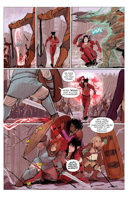
I read Rat Queens, and I thought that it was so awesome, that I looked up the other issues and read those too! I absolutely adore the whole medieval-fantasy setting, it’s a guilty pleasure to me, and I’m all about epic adventures, magical warfare, and fantasy violence, that stuff is super cool! 
The story follows the happenings of an elven mage, a cleric, a dorky dwarven chick, and a tiny weirdo who likes thievery and candy. The characters have so much appeal to me, because their personalities and dynamics with each other are very rich and organic. They don’t feel like the typical heroic, good guy-vigilantes that the townsfolk look up to; instead, they are given evident flaws and are shown making mistakes like any normal person would. We can’t relate to fantasy characters in some fantastical universe, but we can relate to what these characters experience as they go through conflicts. 
There was also a good balance of seriousness and comedy relief. All of the seriousness seemed to be centered more around Hannah and Dee, but all of the funny moments happened between small adventures that Betty and Violet would go on (that one part where they go sledding and meet a friendly, candy-hoarding dragon was so adorable). Although all of these characters are unique in their own way, they synergize well when they all come together, and make a badass, monster-slaying team. 

Also, of course I have to mention the art style. I looked it up, and it turns out the first volume was illustrated by three different artists, then the second volume (2017) had a different artist. Regardless of whoever drew the thing, the illustrations were absolutely gorgeous regardless. Everything was colorful and had very establishing backgrounds to give a great sense of the fantasy world that the story takes place in. It was dynamic and colorful, and the effects for the magic particles looked so nice. The style reminded me of the Team Fortress 2 comics before the artist changed, it’s probably the thick lines and saturated color (this is referring to the first volume of Rat Queens). 

Below I have examples of how the style changed over time (psst, the last one is my favorite!)


Thursday, April 6, 2017

Week 11

For this week, I read A History of Violence. 
I guess you could call this graphic novel a suspense thriller, because the fast pacing of it and dark, exciting undertones really keep you on-edge the whole time.
The story follows a cafe owner named Tom McKenna. One day, an armed robber and his sidekick showed up to McKenna's cafe, and McKenna killed the gunman in defense of his restaurant. This scene attracted the attention of the local mafia, and its lead hitman, Torrino, swears that he and McKenna have encountered in the past (Torrino wears the severed finger of his assailant on a pendent around his neck, and McKenna just so happens to be missing a finger).
Like the title suggests, this graphic novel is very violent, complete with imagery of hospitalized patients getting stabbed in the throats, people falling off of buildings and landing in the street, chainsaw fights (you can only assume what those would look like), torture scenes, etc.

The visuals are shocking, yet really cool, and the art style of this comic just furthers that. The illustrations are very messy-looking, scribbly, and utilize heavy crosshatching for values. Some of the things that actually happen in a few of the scenes are bad enough to imagine, but the roughness of the drawings actually make the imagery appear far more painful and intense than they already are; they are given an almost chaotic feel, and it's easy to see the life and action of the drawings through the style. If the drawings were more refined, it would probably be less effective in capturing the intensity and action of the scenarios.
Below are examples of how awesome the messy crosshatching looks, and also cool, morbid imagery :)


Wednesday, March 29, 2017

Week 10

I kinda like manga. Even though I feel like I watch more anime than read manga nowadays, it's still very enjoyable. This week, I read Battle Angel, and I really enjoyed it. I really liked the universe that the story was set in, it had a dry grittiness to it, despite being set in the future...kind of like the Borderlands games.
The story follows a cyborg who was refurbished from the Scrapyard by a doctor/scientist guy, and becomes a bounty hunter warrior. The idea of cyborgs and dystopian future is cool an all, but what really attracted me to this manga was the illustration. I'm really into high action and dynamic movements, and it's conveyed so nicely in Battle Angel. Since the scenes are high action and there's a lot of movement, the panels are illustrated in a sequential way, and rightly so, because if there were less drawings in an action scene, the intensity of what ever is happening would come across as stale and boring. Having enough drawings to make a shot look more animated is vital when it comes to action.

Here's an example that I liked:


Another thing that I especially liked about this manga was the style. I'm pretty picky when it comes to manga and anime, because I only become invested in the ones that are very stylized. I really dislike the shoujo style; it looks too generic and makes my eyes hurt. If the style looks like something that I've seen before in some other anime/manga, I tend to stray away from it. Like, my top three favorite anime are One Punch Man, Kill la Kill, and Mob Psycho 100. Heck, the One Punch Man manga (not the original drawn by ONE himself, the one following the anime) was absolutely gorgeous to me. Very dynamic, high action, and a great variation of drawing style. Battle Angel gave me those same vibes when I read it, since the visual appeal is related.

Tuesday, March 21, 2017

Week 9

This week, I read Moebius' Heavy Metal comic. I don't have much experience or knowledge in this comic influence, and what little I know about the culture of this comes from the "Major Boobage" episode of South Park. 
It had a very good first impression on me. I thought this comic had very nice visual appeal, but in a very trippy way. It was colorful and bright, and gave a very otherworldly sensation. It was made up of various short comics by a number of different artists, but each of them seemed to take place on another world or dimension, or something, which was awesome to me. I'm really into all of the sci-fi themes, and any sort of unrealistic setting.
Many of the stories that were in the comic were easy to understand without the dialogue, which goes to show that the visual storytelling was very well done, and the illustrations were very clear and easy to read.
This comic also seemed to have a level of sophistication for an adult comic, than a typical American Underground Comic would. The Heavy Metal comic did have some provocative tones in it, like gore and sexual themes, but it seemed to be implemented purely for aesthetic reasons, where as an American comic would have done it solely for the sake of provoking people.
It was a nice change, and over, the experience was really cool.


Sunday, March 19, 2017

Week 8

When it comes to comics, I'm personally not one for nonfiction. Nonfiction is not necessarily a bad thing, I'd just rather read something else as a getaway from reality.
Despite me feeling this way, I actually really enjoyed the March graphic novel. The civil rights movement was a very important way of progress in American history, but I don't really care about it, since I wasn't alive during that time and it doesn't affect me. The story took this history event that doesn't interest me, and made it so much more enjoyable. I have never heard of John Lewis before, but I must say, his story is very interesting.
I think what held my interest the most in this comic was the art style. Each page was so well-illustrated, in an almost cinematic way. The intricate detail and the use of intense values put so much life into the pictures. An observation that I made was that every time something really intense or dramatic was happening in a scene, such as when John was describing his poor experiences with the chickens, the where they get the phone call about the bombing, and when they attend a nonviolence gathering and are tested to react under stress. Each of this parts, and others alike, take an emotional toll on the main character, and the values used in the illustrations reflect this. While the pages throughout the comic have panels on white backgrounds, this has its panels on black backgrounds. This simple use of tone alone makes everything, even the narrative, seem a whole lot darker.

Thursday, March 2, 2017

Week 7

I had never read Maus before, so it was an interesting experience to look at it with fresh eyes.
The analogy of using animal stereotypes in place of humans allows the story to touch on things that would make readers feel uncomfortable if humans were used instead. Zootopia did had the same effect: the controversial story is obviously about us, but using animals instead of human characters makes it more comfortable for the viewers since the reality isn't as blatant.
I thought the perspective was interesting, since the story was being told by the father of a character who is writing his experiences. The story often jumped back and forth between Vladek's past, and what was happening in reality as he told the story.
The story had a gradual escalation of events, and this is where the book fell off for me. In the first volume before Vladek actually gets to Auschwitz, the story feels very flat and not-engaging. It has several deaths, which have the potential to be tragic and evoke sad feelings with the reader, but they are presented in a "telling versus showing" sort of way. If those events were shown and carried out, and even included more dynamics in the characters, it would be more interesting and allow the reader to sympathize with the characters.
Sympathizing with the characters is another point that I want to make, since I found it very difficult to do so. Of course, the Holocaust was one of the most horrible and tragic events in history, so anything involving it should give an audience an unsettling sensation. I felt that it was different in this case, because the reader is pulled out of the action. If the readers are supposed to really sympathize with what the characters are going through, they should be pulled into what's happening instead of being told by the characters. I guess this was done to make the horrific events more subtle, but considering this is about the Holocaust, I would have expected it to be pushed more.
Also, an interesting observation I made was that the drawing quality of this narrative changes dramatically over time. The very beginning of the first volume has clearer and more refined drawings, especially with the style that the mice are drawn in. The drawings become more simplified and graphic-looking over time.

Tuesday, February 21, 2017

Week 6

The Underground Comics were... interesting, to say the least. I read a bunch of them, but I thoroughly studied the Air Pirates comic.

One thing that I found interesting in many of these issues of Underground Comics was the variety. A lot of the issues compile comics of many different artists; some are very visually unappealing, and others, are really pretty to look at. Some of the really horribly-drawn comics made me wonder if some of the artists behind these comics were rejected comic artists, who sellout to making Underground Comics. The Zap Comicx are a good example of not only this artistic variety, but also content variety. The issue of Zap that I read had some stupid comics with the occasional raunchy humor, but it also contained extremely explicit content that depicted intense acts of violence and graphic sexual material, as well as political commentary. The political commentary was presented in a way that I would expect. The strip in the issue of Zap that I saw showed depictions of society around the world compared to the "perfect" America, so you get the racist stereotypes, or whatever. It didn't really phase me.

The graphic material in some of these Underground Comics was actually kind of...funny to me? I'm one of the weird types who enjoys really dark humor, and I don't get offended by anything, really. Especially in Air Pirates, I thought the content was genuinely humorous. I normally don't find explicit sexual content to be appealing, but the comics that deliberately parodied the Disney characters were taken to such extreme levels, that it ended up being funny to me. Yes, the content was very edgy, but it was pushed to such a high level of absurdity, that I found it amusing, to an extent. It was something that I would have expected from one of the older, more explicit (and better) episodes of South Park. Anyone could make a stupid pornographic comic, but it becomes creative when it involves sex with an anthropomorphic caterpillar woman with fifty vaginas. Stuff like this is so stupid and bad, that it ends up being funny, which I am guilty of thinking.

Tuesday, February 14, 2017

Week 5

This week, I studied Will Eisner's Life on Another Planet. 

What really struck me about this graphic novel was the style. The drawing quality strays away from the typical realistic comic style, and goes into a more exaggerated and expressive style. Eisner portrays the characters as caricatures, and focuses more on emphasizing their movement rather than having them stand stiffly while looking pretty (like a lot of characters in the action comics looked). The characters express emotion by using their entire body, which gives the drawings a very organic and convincing feel that pushes the drama levels extremely high.
For instance, toward the beginning of Life on Another Planet, the two main characters are caught eavesdropping by an antagonist, and they end up bashing his head with a rock. The movement in these sequential drawings are so clear and convincing, that it's difficult to not feel queasy after seeing it.
Also, this brings me to mentioning that the way that the characters are illustrated interacting together is so beautiful. There is sort of a cohesive motion to the characters in each drawing, and they way that Eisner illustrates this motion brings out the feeling in how the characters interact with each other. I think that seeing the relationship between two characters makes a drawing so much more interesting to look at since there's some sort of dynamic to be seen, and since his drawings are composed so heavily of character emotion and interaction, they're so much more interesting.

Something else I've noticed is that Will Eisner utilizes the space on each of the pages. He doesn't limit the drawings to single panels, but instead, takes advantage of any space given on the paper. More often than not, the drawings fall out of panels and almost flow into each other, and it's a beautiful thing to look at. It's as if each page is its own composition, holding an important, individual part to the story. This inconsistency of panel illustration also makes the graphic novel more engaging, since the actual layout of drawings on each page gives the reader's eyes a fresh sight every time.

Monday, February 6, 2017

Week 4

I looked into action comics quite a bit for this segment, so I'm going to be talking about those!

I'm not sure whether or not it was the writers' intention, but I found the comics to be kind of funny; especially the Superman and Marvel comics. Comparing the Superman comics to the Marvel ones, the Superman ones, for the most part, are more text-driven, whereas the Marvel comics have a lot of panels per page to support its text. What I find comical about the way these issues are written is the dialogue. Almost every text bubble ends in an exclamation mark, and in my head, I always read all the dialogue as ridiculously over-enthused. It's like the kind of silly narration you would typically get from a Fairly Oddparents episode that's centered around the Crimson Chin. This is just a funny trope, and seeing the source material gives me a new appreciation for it!

Another similarity between these two action comic books is that they're not just one story. Both issues have a main story, which is showcased on the cover, but also include other short stories, ranging from cowboys to hunting animals in the jungle. The superhero-themed story on the cover is continued in later issues, and those later issues will contain other shorts as well.

Also, I'm just going to say that the action in these comics are very over-played and almost cliche, specially in the Superman comic books, but I guess that's just another feature that makes them entertaining to read. The level of absurdity is definitely an interest-holder (seriously, Superman? "Balloon beasts?" That's ridiculous!)

Tuesday, January 24, 2017

Week 3

Though comic strips seemed really awesome for their time and were highly regarded in society, I feel like their early executions were very primitive compared to modern comic-making techniques.

Early comic strips appeared to be very experimental. So many of them posses intricate styles that have include a lot of detail and high production value, while others were simple and minimalist. With the more detailed comics, I noticed a reoccurring problem where the artists' would skew the written text, or barely try to fit it into text bubbles, as if they were not prepared ahead of time with how much text to include in a single bubble.
Another problem I saw with some comic strips was that the drawings in the panels were pretty descriptive and it was really easy to interpret what was happening in them, but the characters were saying exactly what they were doing, which real people obviously don't do. If a character is already doing something; raking some leaves, for example, he or she would not say out loud "Here I am raking the leaves." Instead, they should have dialogue to aid the image, maybe something along the lines of "wow, there sure are a lot of leaves to rake!"

Regardless, I really like seeing the variety of comic strips. It's really cool to see different artists have their own take on this art form, and what they come up with is very unique. It's amazing to see the most beautifully illustrated comics compared to something silly and minimalist. They're both comics, but I find it very interesting how different artists visualize.

Thursday, January 19, 2017

Week 2

Understanding Comics by Scott McCloud

This comic was interesting because it described concepts that I'm familiar with, but went into detail as to how and why they are important to understanding comics. Concepts such as icons, simplification, and gutters are all things that are important to the art of graphic narrative, but I could never explain why, and Understanding Comics does just that. 

Icons are important because they are used to represent a person, place, thing, or idea. There are symbols that people naturally recognize as some "thing," and using said symbols in place of extremely descriptive drawing could get the same point across just as effectively, because the symbols are so "iconic" to people. 

Every storyteller wants their readers to connect with what they're reading. Simplification, especially of characters, is used to help the reader relate to the characters in the story. The more detail something has, the more distinct and descriptive it is, making it difficult for a viewer to connect with something that's so established already. If a character has a simple design, it's easier for the reader so see him or herself in the shoes of the character. 

In film, the passage of time is usually represented by a cross-fade or dissolve. In comics, time is represented by the gutters that divide the panels. When the panels are divided into separate sections, this indicates a pass of time. Everything that occurs in a single panel is a single event. I just find how time is portrayed in comics to be very interesting, especially since there's a concrete explanation for how it's executed as shown by Scott McCloud. 

Tuesday, January 17, 2017

Max Ernst Une Semaine de Bonte

There are graphic narratives: The Rooster's Laughter and Easter Island. Each of these sets of images seem to have their own separate meaning.

In The Rooster's Laughter, we see a series of illustrations that depict macabre events, mostly death and horrible things happening (such as the drawing of these beasts kidnapping women from a train). All of these illustrations include the image of a rooster somewhere in the scene. The acts of death or violence shown here include burial ceremonies, hangings, torture, gunfights, and what looks like murder. At the beginning of the sequence, there are two quotes from Marcel Schwob, that refer to people who hide their true face, and their capability to be happy at some times, and act cruel toward others at other times. The roosters in these images are never portrayed as the victims, only bystanders or the characters' that commit the horrific acts. Maybe the meaning of this series is about sociopaths and the lack of concern that some have for others, using a rooster as a metaphor. The roosters shown have no concern for the victims of the violence, or are actually doing said acts, and if they are bystanders, they're not doing anything, just staring blankly at the violence. It's very disturbing, but I think the story behind this is about the violent nature of people and their lack of concern for what they're doing, using the image of a rooster.

In Easter Island, the conflict becomes more specific. Unlike The Rooster's Laughter, the pictures aren't resulting in death. All of the men are depicted as Easter Island heads, and each drawing involves a conflict with a woman. Some of them look lustful, others are violent, some depict rape, and even a sense of longing, almost. Each Easter Island head is experiencing something different with women. This is possibly about the nature of men, or maybe even things hypothetical men have done, and regret, using the victimization of women.

Wednesday, January 11, 2017

Week 1

The Arrival by Shaun Tan


In this graphic narrative, I feel as though the immigration-themed undertones came across very clearly. The first and last pages show a huge display of many different people, all who seem to be of different races or ethnicities. This is the first indicator that the story deals with immigration, because why else would that many different people be shown? If the story was not metaphorical and was instead about the life of one man leaving his home to go to a new, foreign world, it would seem senseless to show the faces of all of the different foreign people. The two pages that show said foreign people imply that this is not just the story of one person, but instead, the stories of numerous people, immigrants, and their experiences with traveling to distant lands in hope for a new life better than the one they left at home. 

The actual world that this story takes place in is also a huge indicator of the immigration theme. Despite the locations looking whimsical and impractical to reality, there are subtle details in the drawings that tie the world into real life. The setting that stuck out to me the most included tall skyscrapers that overlooked a body of water, and it was very clear that this was supposed to represent New York. Ellis Island served as a gateway and immigrant inspection station in New York Bay that immigrants had to go through in order to enter the United States. 

Also in the story, we see the struggles of the man as he tries to adjust to this new world. He is unfamiliar with the area and has to ask locals for help, he doesn’t really know the native language too well, he struggles with finding and keeping a job, and so on. These are all problems that many immigrants faced in reality. Later on in the story after his wife and daughter find him and move back in with him, the daughter is found teaching the new ways of this country she’s learned to other immigrants. 

All of these things directly reference early immigration, and are easy to relate with the basic struggles that many real immigrants had to face in history.